By Rebecca Fitzsimmons
When Chelsea Cobb and her husband Martin found the perfect lot in Oakville, they found the ideal match in luxury home and estate builder Project Construction Management (PCM), to help them build their dream home.

Carlos Jardino, owner of PCM, can innately orchestrate his trades, says Chelsea, lining them up perfectly in terms of scheduling and timing on site, a major advantage when constructing custom homes of such grandeur. PCM demolished the existing home in one day and the lush wooded lot on Elton Park was ready. “The PCM trades have worked with Carlos for many years so there is a strong synergy between them all,” she says.

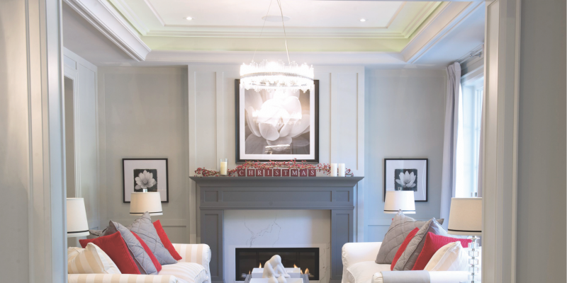
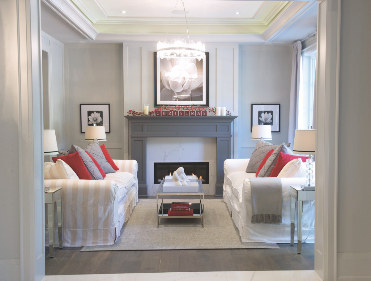
As an interior designer, it was only natural that Chelsea had a desire to design her own home. Together with PCM, she was able to live that dream. Upon entry through the large front doors, an oversized foyer awaits, flanked by the dining room to the left and the living room to the right and a five-foot open space to the library above. Chelsea’s love of symmetry is immediately evident. “I’m completely in love with it,” she admits. “It’s right from the exterior to the interior, to the layout of the rooms, the furniture placement, the lighting fixtures – everywhere possible. For me personally there’s nothing better. It just looks perfect. It’s so pleasing to the eye.” Perhaps her penchant for pairs is a maternal instinct. Even her twins’ bedrooms are of equal size, with as much similar layout as possible. Both the living room and dining room each have mantels; the living room features a gas fireplace while the dining room mantle is merely decorative. Even the powder room has double sinks.
In the living room the ambience is more casual, open to the office at the back. “That’s why I combined the space between the living room and the office so it’s instantly more casual,” she says. The built-in cabinetry in the office helps create that casual look and around the corner is the study, which she and her husband share. The hardwood flooring throughout is from Vintage in seven-inch wide plank style, called Excalibur. “It has a lovely casual feel – very informal, with quirky bits of colour with grey undertones and twists of purple.” Intricate ceiling work with plaster moldings in the living and dining room from Canamould Extrusions Inc. make a statement and a hidden light cove with rope lighting offers a subtle evening glow. All of the light fixtures and lamps are from Concept Lighting.
Longevity was Chelsea’s end goal. “I wanted this house not to age.” She defines the style as classic contemporary. It follows a classic footprint but also has current features and twists. “I choose something because I like it,” she says. The décor is neutral throughout – the walls in the public spaces are painted in Benjamin Moore’s Stonington Grey, accented by the darker Candle Charcoal. “The two work so well together as a pair.”
The large 32-inch porcelain tile in the foyer is also repeated in other areas including the kitchen and in 24-inch for the bathrooms. The kitchen uses a matte version as Chelsea feels it’s more casual. “The repetition of materials is deliberate because I wanted to have one coherent design (apart from the bedrooms) which tend to do their own thing,” she explains. Where curtain panels are used, including the living room, dining room and bedrooms, Chelsea chose clear acrylic curtain rods and fabric from the panels from JF Fabrics.
In the kitchen Chelsea relinquished a traditional oven for a cooktop and wall ovens on either side for balance. They’re more ergonomically friendly and also offer more of a workshop vibe. The space is open, clean and bright. The acrylic white island cabinetry is modern but coupled with a more classic shaker style door in charcoal along the back wall.
Jardino gifted to them several framed photos that show the various stages of the project that he took personally with a drone. “It already brings back lots of memories. You get a glimpse of the scale and size of this as a project,” says Chelsea.
Moving directly into the family room, seating converges in front of the built-in cabinetry and TV, painted again in Candle Charcoal. PM Fine Cabinetry did all cabinetry and built-in work. The couches are from Gresham House using JF Fabrics upholstery. “I love the high walled sides,” she says. “In a room this size you feel nice and cosy.” The four-inch band at the bottom elicits an almost corporate feel. Bonus: they’re removable and washable.
Since there’s only one wall of cabinetry in the kitchen, the hall pantry near the mudroom is a convenient countertop to place groceries. “When I designed the house I knew exactly where I wanted all of my cabinetry to go.” Around the corner is the butler’s pantry.
Leading up the stairs, which is low-lit by small led lights, is the upstairs hallway with a vaulted ceiling and bright skylight. In the master bedroom Chelsea created a vestibule with a dressing table, on the left is the walkthrough closet and ensuite, to the right is the bedroom, which again features the double moldings on the ceiling and two ceiling fixtures. She says the wall colour and trim were purposefully painted the same colour for a seamless look. The cube design in the fixtures carries throughout the bedroom in the other fixtures and sconces.
Without feeling too vast, the vaulted ceiling in the ensuite is open and airy; the walls are painted in Benjamin Moore’s Revere Pewter and the large shower is placed at the back of the room with his and hers entry and the tub is featured in front. Beveled Edge supplied all of the quartz countertops and fireplace surrounds.
Guests will also get a taste for Chelsea’s design in the ‘retreat’ which features Stonington Grey and Revere Pewter coloured walls that flow into the ensuite and a feature wall covered in JF Fabrics wallpaper (which is also used in the downstairs powder room). Plumbing fixtures are from PMF Plumbing.
At the front of the house Chelsea placed her children’s bedrooms on either side of the library. Their beds and desks are placed in the same position for symmetry’s sake. Molly’s room is painted in Benjamin Moore’s Silver Fox with a wallpapered feature wall and carries an old Hollywood theme. Jack’s room is painted in Benjamin Moore’s Chelsea and denotes a masculine tone.
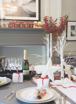
The family will be enjoying their first Christmas in the home. “I think that was one reason the dining room was important to us,” she says. “We’re picturing lots of Christmases in the future as we grow as a family.” Being a “home bird” as Chelsea puts it, this space truly means something. “If you can come home to your family and feel peaceful and comfortable that’s a good thing.”

