By Kelly Putter Photography by Nikki Wesley
A Mississauga home gets a beautiful makeover without any renovation fuss.
Whether you’re altering a favourite party dress, a website for your side hustle or a grungy, unlived-in family room, it pays to reflect on how you’d like the final product to look. Once that’s nailed down, you can arrive at your design with ease because, in essence, you’re working the plan backwards.
That’s pretty much what Michelle Mazzilli did when she was called upon to redo a Mississauga client’s Lorne Park home. The senior designer at Elizabeth Interiors in Burlington just happened to pick up the phone the day her client called with questions about refurbishing her centre-hall lay-out. “It was a very lucky day for me — and for her,” says Mazzilli, with a chuckle. “We immediately landed on the same page of what she was looking for and what I was suggesting.”
That phone call was easy-peasy but that’s not always the case. Sometimes the relationship between designer and client doesn’t always gel. Elizabeth Interiors has seen that happen and another designer is usually asked to step in. But these are simply the kind of hiccups that can occur when taking on a major overhaul. Typically, Mazzilli begins the design process with a line of questioning.
“The first thing I would say to a client is do you have a clear vision of how you’d like your home to look,” she explains. “The client might say yes, they might say no. Then I ask if they have any pictures of rooms they love or if they can verbally describe to me what it is they’re after. I almost always ask, do you want it to be on trend? If a client has no idea, that’s when we do a deep dive with our line of questioning. Do you like dark wood, light wood, opulent fabrics as opposed to more casual and informal fabrics? So even if the client can’t articulate the big picture I can get to it by picking away at smaller design elements such as colour palettes and tones of wood.”
This Mississauga home in a well-established neighbourhood situated between Lake Ontario and the Queen Elizabeth Way is the perfect prototype on how to refresh your living space without spending hundreds of thousands on a costly renovation.
“Everybody wants to fall in love with their house again,” says Mazzilli.
“It’s our job to make you fall head over heels with your space. This is so much easier than moving to a new home or going through the exercise of a highly disruptive and expensive renovation. Why not consider placing your home in the hands of a professional and instead revamp your décor?”
The client definitely wanted to lighten up the home’s interior, which showcased a dark colour palette thanks to Elizabeth Interiors, which had also refurbished the home 12 years earlier. Clean lines, lighter woods and fabrics with a traditional feel is what the homeowner was after.
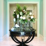
When you walk into the home, the obvious focal point in the centre hall is a striking table that mixes a metal base with a black round stone top. The homeowner adds drama by dressing the table with various sizes of glass vases, candlesticks and white magnolias. The ceiling is painted in a much darker tone than the walls’ soft shade of French blue to create some warmth in the colour palette.
The watery tones of blue are used throughout the entire home.
The piano room to the left showcases an imposing baby grand piano and sitting room. The room features two celadon green shimmer velvet armchairs across from a clean, traditional sofa in a woven fabric. A contemporary painting on the back wall incorporates the room’s tones of blue, green and silver. Above the sofa is an exaggerated scale starburst mirror in an opulent aged finish which supports all finishes in the room. The lighting is elegant but whimsical, again in luxurious metal finishes.
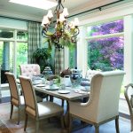
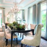
As you move into the dining room, eyes cast upwards to a soft champagne willow pattern paper that adorns the tray ceiling and is complemented by a traditional antique silver crystal chandelier. The room features a simple yet formal table with seating for eight to 10 and a china buffet in matching dark mink tones with champagne highlights. The side chairs are ivory tufted and the host chairs are upholstered in a graceful, celadon willow-printed fabric which echoes the botanical feel of the ceiling paper. Mazzilli chose a silver chest for the far wall in the dining room topped with custom lamps that feature a quartz starburst detail. Adding a hint of romance and femininity to the rooms, the drapery in both the dining and piano rooms is custom-trimmed with a silver taping in a scrolled pattern that sets off the celadon silk fabric. Matching area rugs in soft pewter, grey and blue ground each of the dining and piano rooms, adding harmony to these two principal rooms.
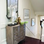
Moving further into the home, the hallway opens up to the staircase area where a rustic hand-painted chest of drawers and antique mirror dress the panel-moulded walls on your way up and down the staircase. Another silk area rug in silver and walnut tones warms up this area, which leads you to the blue and white décor of the home’s back family room and kitchen.WW
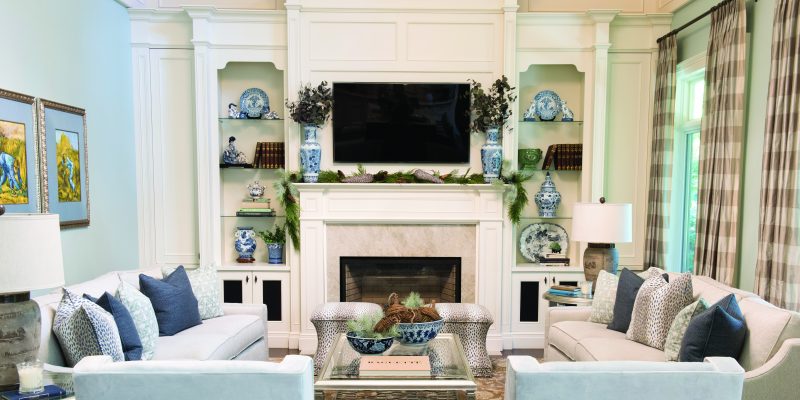
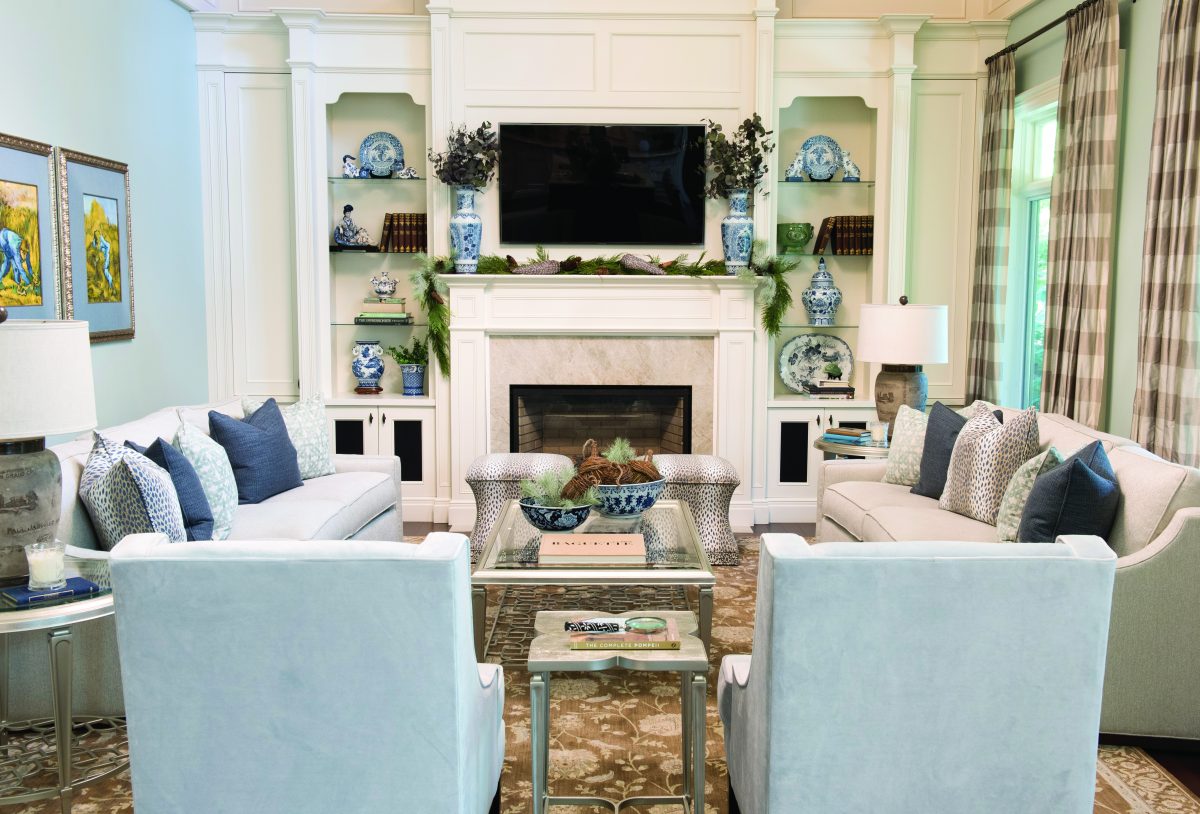
The comfortable personality of the family room is achieved with softer, tactile fabrics in blues and taupe. The woven fabric on the sofas has the quietest undertone of celadon that really comes to life in the natural light, especially when you notice the soft blue tone that was used on the ceiling. The glass-and-champagne-tone occasional tables elevate the room’s elegance. Bunching velvet cheetah fabric fireside stools are chic and perfect for accommodating larger family gatherings.
The casual dining area in the kitchen is spacious and showcases the luxurious but practical soft wood tones of the table and chairs. The wide checked silk drapery panels are classic and add a sense of pretty to the kitchen. The soaring island always has a display of serving dishes and candles, just waiting to be enjoyed.
The back end of the kitchen leads to the breezeway area. This galley-style entrance is casual but so useful thanks to its abundance of storage. A rustic cabinet is featured and it is flanked by two funky zebra hide stools.
This Lorne Park transformation is an example of how more traditional or classic tastes can be refashioned into a new design that is contemporary and fresh. “Many of today’s homeowners lean toward modern, often with the misconception that traditional can’t deliver a new look,” says Mazzilli. “But I think the new clean traditional is so on trend. It’s classic and honours the traditional styling of the build. It’s refreshing to see lovely traditional dressed homes like this and definitely a mainstay in interior design that we expect to enjoy in established areas such as this.”
