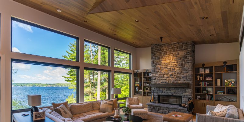
A new cottage perched high atop Lake Joseph will form many a memory
By Rebecca Dumais, Photos by Navigator Visuals |
There’s probably not much of a debate when it comes to the quintessential cottage setting. Being on the water is where it’s at.
For the clients of this newly built cottage perched high above Lake Joseph in Muskoka, the view is paramount. “The clients, well versed in cottage life and demonstrating a strong grasp on form, laid out a design brief that was small on ego and big on proportion,” says David Gillett of David Gillett Design Ltd., the firm that designed the home. “They wanted a building that would accommodate a growing family while at the same time sitting lightly on the land and making the most of the steeply sloping lot, distant lake views and mature woods.”
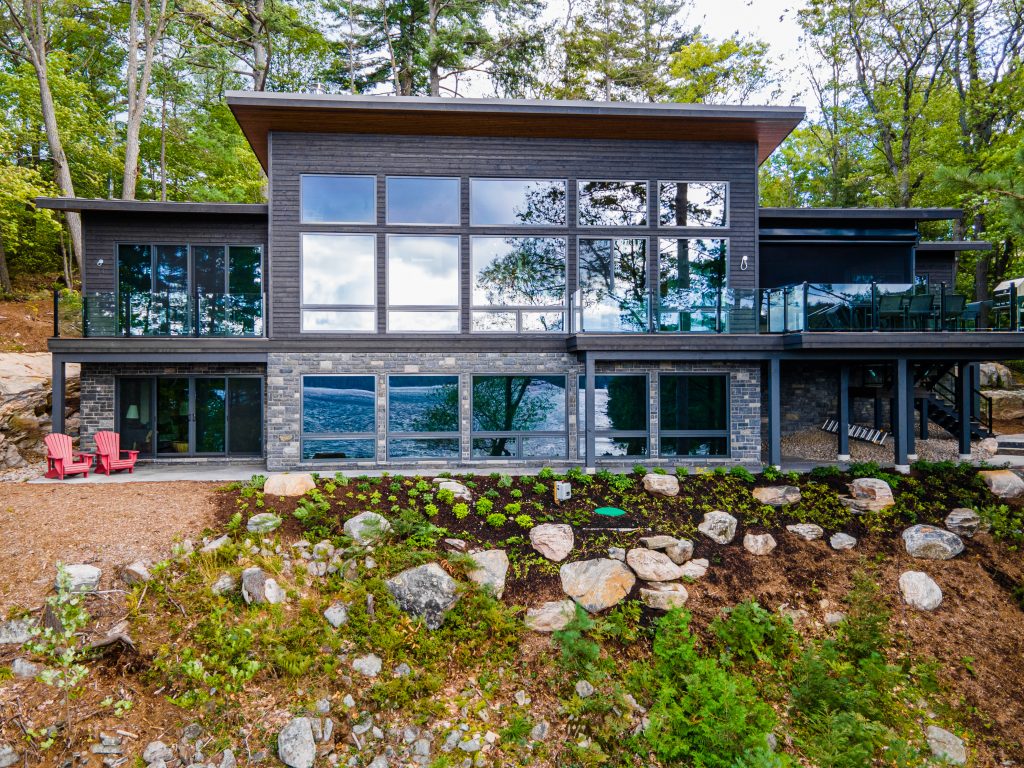 Bigger was not better in the clients’ eyes, Gillett mentions. The right size and a working layout were factors that mattered, “and if we could find some flourishes to give the building some delight, so much the better. With clients like these, the building practically designed itself,” he says.
In Muskoka, the natural landscape of a property is always an initial concern before a project starts. Before the foundation is laid, there’s a significant amount of planning involved to make sure the site is prepped, properly excavated and blasted in order to begin the build. “This site, of course, was one that needed all of the above,” says Hayden Woods of Earl Ferguson Construction. “Once the blasting and excavation were complete, we had a flat surface to build off of. This helped with making the remainder of the build smooth.”
Concerning the finishes and overall look, a Scandinavian feel was the look the clients chose. According to Woods, some more specific details were to have clean lines, lots of wood and for it to feel uncluttered. “They wanted to maximize the view from all principal rooms, including the bedrooms. They wanted something low maintenance but still keeping it warm, inviting and cozy with the open concept,” he adds.
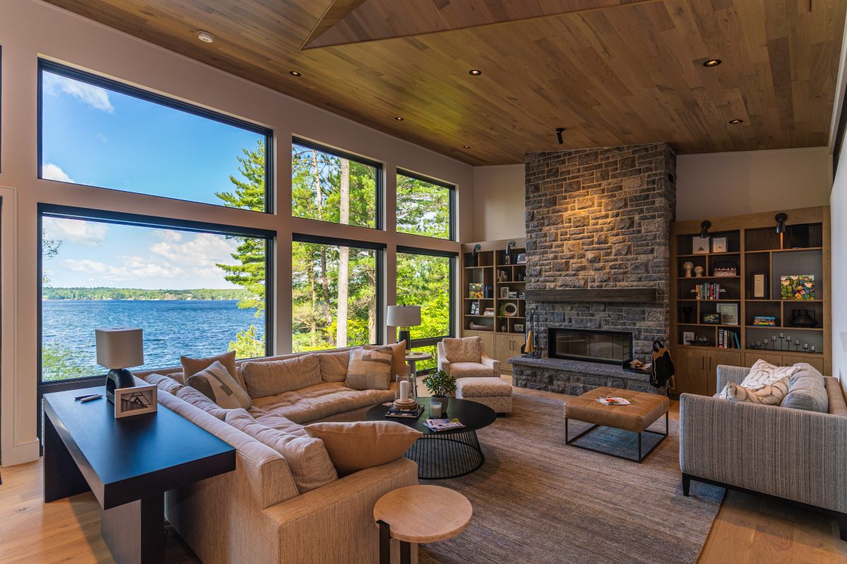
The entire lake-facing side of the cottage is all windows so that the exterior almost became a part of the interior. Much of the colour palette was developed with what Mother Nature placed in front of them: varying shades of green and birch bark grey tones.
The master bedroom, one guest bedroom, and powder room are located on the main level along with the kitchen, dining area and great room.
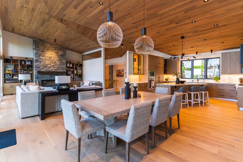
 The design of the great room came together after the selection of the stone on the fireplace, which was also repeated on the cottage’s exterior. The interior design is light and airy, with caramel, cream and green tones. The owners are empty nesters with five granddaughters and two more on the way, and some family portraits and memorabilia are displayed in the room.
The heavy use of hardwood, installed by Wüd Floors, located in Oakville, adds to that warm, welcoming cottage feel. Tammy Kember, Co-President of Wüd Floors says the clients were drawn to a raw-looking white oak. “We call it naked oak because it brings out the natural character and beauty of the raw white oak,” she says. “It very much looks like a raw, unfinished white oak, but it is pre-finished for durability and longevity.”
The final product they chose was a seven-inch European white oak “in character grade, showcasing natural variations through both the mineral and knots that can be seen, says Kember. “This product boasts premium length boards. Over 80 per cent of the floorboards are between six and seven-a-half feet in length.”
The boards on the ceiling are five-foot-long white oak, also in character grade.
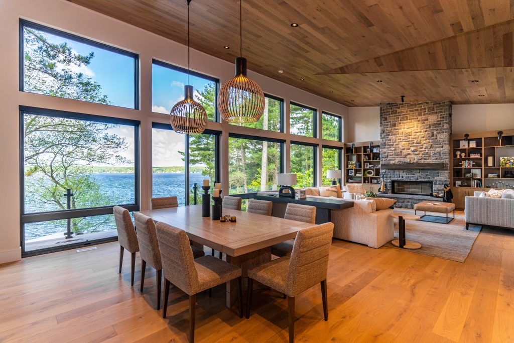 Engineered flooring for cottages in northern lakeside settings are ideal, Kember notes, where temperature and climate changes need to be considered. “Engineered flooring thrives in this environment where the humidity fluctuates in summer and winter.”
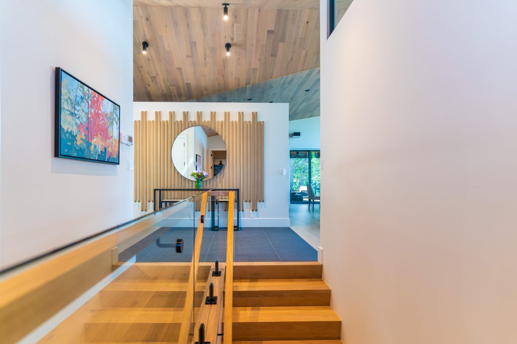
The ceiling is a truly unique architectural detail. “The single slope roof, which floats above the open plan living space, is highlighted by a wedge-shaped, airplane-like incision in the ceiling, leading the eye like an arrow to the lake,” says Gillett. “It’s actually the underside of a gable that, in its practical role, helps shed water and ice from over the entry.” The monopoint lighting on the ceiling highlights the unique lines and angles on the ceiling, as well as draws the eye from the front entry right to the back of the cottage.
The wall to the left of the fireplace in the great room has a long horizontal window along the top, which was done to let light in from the back of the window-filled cottage to the front entrance and stairs that lead to the lower level.
After meal preparations in the kitchen, there is welcoming seating at the dining table or at the large triangular island, which again features the unique slatted wood look in its tambour-like design at the end. The design feature is carried over to the range hood’s metal slat design. The fridge is tucked behind the kitchen’s crosscut oak cabinetry.
 The covered porch, accessible from the main level, features a BBQ and some seating where people can gather for a drink, a meal or even a bit of rainy reading, with unobstructed views of the lake, or be comfortably sheltered by the retractable bug screens. Retractable storm shutters will protect the space in bad weather and avoid snow accumulation in the off-season.
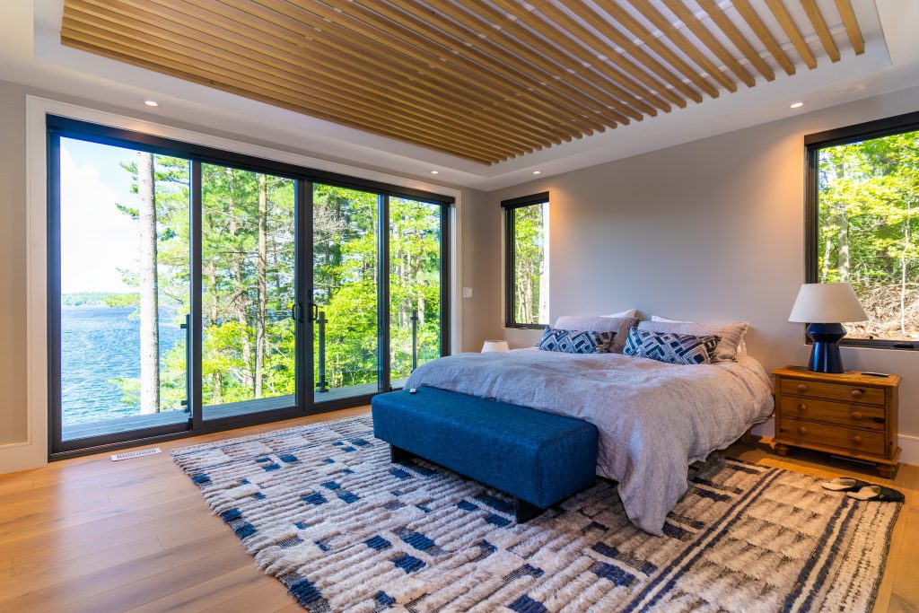
The design theme, colours, tones and material carries into the master bedroom. The ceiling, again, wood, has a unique detail of its own. The perimeter has a bulkhead with a raised centre where wood slats were installed. The addition of pot lights adds warmth and interest. The colours for the room were pulled from the carpet, which has a relaxed, comfortable nubby texture.
Guest will appreciate the emulated design elements from the master – the use of similar tones in the guest room, set against a blue accent wall. The walkout balcony offers a perfect view while enjoying that first cup of coffee.
The gorgeous oval tub with its wooden deck makes for an inviting evening after a long day playing outdoors. The ensuite also features a glass shower and double vanity with a back shelf.
 Smaller but mighty in detail, the main floor powder room was designed with a woven three-dimensional stone tile on the back wall and a stone sink. Further details are illustrated through the rectangular faucet and bump out of the vanity.
Following the waterfall staircase down leads to the lower level, which has a full bathroom, two guest rooms, a laundry room, and a media room with a bar.
Even at this level, the outward view from the rooms does not disappoint.
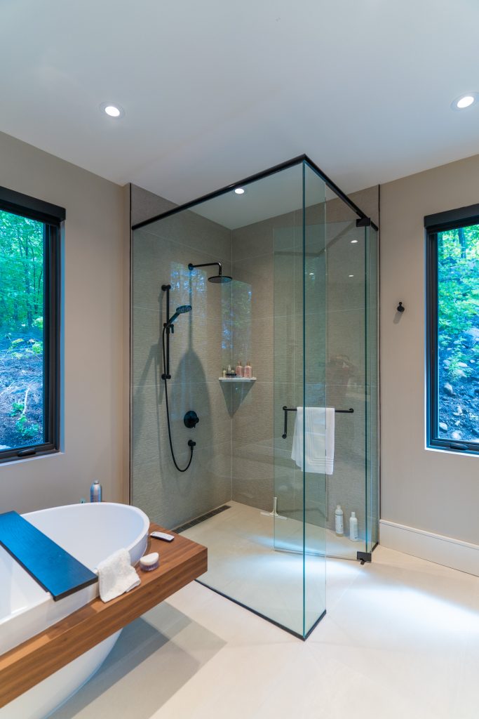
The bathroom has a large glass shower and large windows which reach down to the floor. Here, the tile on the accent wall picks up on the colours you’ll see while gazing out the window, perhaps still rubbing the sleep from your eyes. The view from this room may even make you feel as if you’re in a treehouse, looking out over the water.
When it’s movie night or on a rainy day, the clients can retreat to the media room, finished in muted teals, to watch TV (the only room in the cottage with one). They can also mix themselves a drink from the bar, and the comfortable oversized poufs are up for grabs as seating. Here there is a sliding glass door that leads onto a stone walkway, then down the stone steps to the boathouse.
Some landscaping was done around the cottage, though it was kept natural with simple foliage, and many large stone slabs were placed along the back perimeter.
Of all its many gorgeous finishes, features and details and floor-to-ceiling windows in the great room, Wood believes that the highlight is “no doubt the terrific views and natural light that shine on your face as you walk through the main entry. As a contractor, you take these views for granted, working in the cottage every day. But now and again you have to go back, and the view surprises me every time.”
 The entire project, he says, was enjoyable to work on. “Working with such great sub-trades as well as clients, architects and designers, the building process is nothing short of fun. And seeing something start as a hole in the ground to what it is today, makes you love what you do.”
Architecturally speaking, Gillett says despite the building’s obvious contemporary form, there were some ageless Muskoka details and materials brought into play: granite stonework, natural wood highlights, and large lakeside decks. “Some things just work in this part of the world, and never get old.”
For more information, visit Davidgillettdesign.com & Earlferguson.ca
