No one likes to see a love affair come to an end, but sometimes things just get old and stale. Do you walk away or do you try to rekindle the passion?
In the case of a local couple who had fallen out of love with their home, the answer wasn't an easy one. They loved their neighbourhood, and the idea of moving and starting out with a new home didn't appeal, but they had outgrown the house they had originally fallen in love with.
Their answer was to turn to Georgian Design, a design build firm that does everything from additions to complete home design, and to seek the expertise of in-house designers Johnny Verdile and Ashley Reekie.
Verdile has spent 35 years in the trade, travelled the world and picked up style elements from every country he visited, from South America to the Middle East. Reekie studied design in Vancouver and has been with Georgian for two-and-a-half years. Together they took on the task.
“We made them fall in love with their house again!” Verdile says. “We not only renovated their house, we renovated their lifestyle.”
They did it by turning the outdated and standard suburban home into a clean, spare, high design gem.
“There were certain things the clients wanted ““ she craved a stylish and functional kitchen, the husband wanted a spectacular entranceway and staircase, and the two children wanted a homework station where they could study and relax.
The resulting redesign changed the complete character of the house. By removing walls, adding architectural details and opening up the spaces, a new character of the house emerged, one that was both functional and classic.
“We concentrated on elements that were easy on the eye, that worked well together on the palette, from the colours of the walls to the flooring, from the cabinetry tothe simple clean lighting,” Verdile explained. “But most importantly we continually kept the clients' needs in the forefront.”
The kitchen is now a light-filled area that is open to the dining area and sitting area. The walls were blown out to achieve the open concept, and maximize the space. The kitchen is 24-feet long, with an 11-foot island. Care was taken to make sure the travel distances for kitchen work were within the 21- to 26-inch mark, and that there would be enough room for more than one chef. Light colours accentuate the sense of airiness. Cabinetry is painted Revere Pewter from Benjamin Moore, technically a white with grey/beige overtones. The large island is painted Middleberry Brown, with a white quartz countertop. The countertops for the other cabinetry are Cedarstone in Alpine Mist, with a linear mosaic white backsplash.
The built-in fridge is a Subzero, the ovens are Wolf, with the cooktop is a five-burner gas unit. The dishwasher is integrated into the island, and there are many hidden features: warming drawer, lighting, cabinet dividers, wine fridge and garbage storage. The island can be used as an eating area, with white leather stools and white linen upholstered chairs.
The floors look like warm walnut but in fact are a porcelain tile that looks incredibly realistic with minimal grout lines and low maintenance. The porcelain wood tiles were used throughout the main floor to create a smooth flow and avoid a chopped up transition from one room to another. To expand the space and allow the kitchen to flow into the dining room, a powder room was removed, walls came down and architecturally interesting arches and details were added.
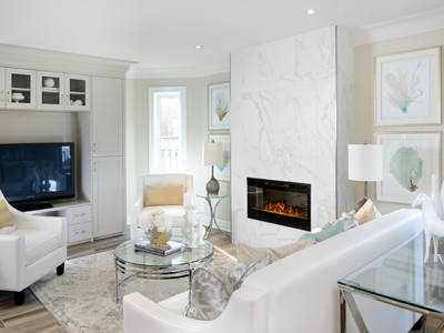
The dining room is now an eat-in area, either for everyday or formal dining. The architectural details, crown moulding and beading tie the rooms together as well as add flair and interest. The trim is painted Benjamin Moore Cloud White and the walls are Balboa Mist. An eye-catching lighting fixture ““ acrylic and chrome with Edison bulbs from Union Lighting ““ hangs over the dining table. The living room's outdated fireplace and mantle were replaced with a modern sleek electric fireplace faced with porcelain tile. The architectural millwork details from the other rooms were continued in the built-in wall unit for the television.
The new open-concept design allowed for the wow factor the owner wanted in the entranceway ““ from the front door, there is a clear view of the spectacular solid oak, handmade staircase, with open risers, solid oak posts and black wrought iron pickets. The curved elegance of its design is the perfect element to anchor the transitional modern aesthetic of the home.
A small ensuite was turned into a spa-like space, with an open-concept glass walled shower. A pewter lighting fixture hangs above the free-standing tub, with standing faucet. The double sinks make the bathroom suitable for two.
“This was a great project,” Verdile says. “The clients allowed us freedom and we gave them more than they were expecting. They had a vision and we made it a reality.”
The three-and-a-half month long project resulted in a home that is now a classic, still homey but not trendy. “It's a classic design with a modern spin,” adds Reekie.
This was not just a pretty design, but a functional redo that satisfied all of the clients' needs, from accessibility to space storage to low maintenance.
And the client's love affair with their home is on again.
