Photography by API photography
by Laurie Wallace-Lynch
Homeowners Kate and Mark had a specific vision to share with CEO/Creative Director and Architectural Designer Joel Tanner of SMPL Design Studio when it came to designing their new dream home. “We had a very specific aesthetic in mind,” says Kate. “We didn’t want a really big house—we wanted a house that was modern, but a warm and inviting family home. We wanted clean, modern lines with a Scandinavian influence and elements of nature throughout.” Joel and his team, with the assistance of the builder Ryan Canu of Terra Nova Homes, turned Kate and Mark’s vision into reality.
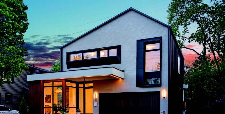
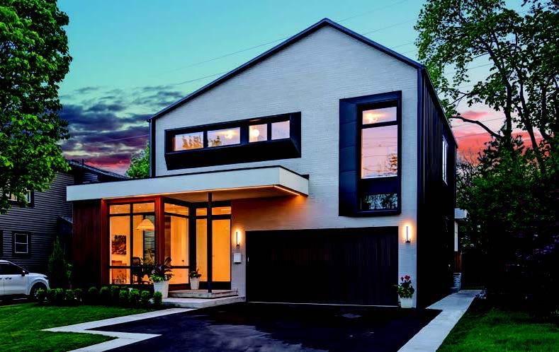
“The homeowners wanted a modern Scandinavian design with clean, tidy lines—what we were trying to do was to create something eccentric and unique for the streetscape but from a form that blended in with the neighbourhood,” says Joel. “Scandinavian design is about clean lines and purposeful design, so there’s no added frills. It’s all about using the natural materials and the simple design aesthetic and layout and function in the space to create the dominant architecture. We are not introducing heavy trim on doors or windows or complex backsplashes in the kitchen. It’s about a controlled, neutral colour palette with natural materials that are low maintenance.”
Located in downtown Burlington within walking distance to shops and Lake Ontario, the home is 2,400 square feet on two levels along with the lower level which has a rec room, cold room, and a full in-law suite with a separate side entrance.
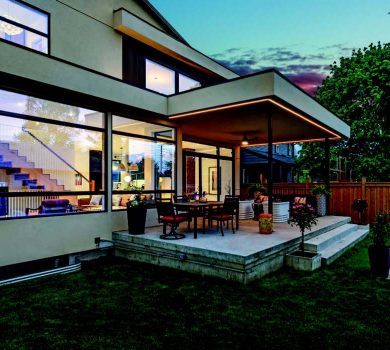
“It’s not a massive space, but it’s how you use the space with intention to make every nook and cranny useable in the home,” adds Joel. The home’s exterior features a white brick façade, counterbalanced with darker toned pre-finished wood-look slat accent and custom-made shadow boxes framing the windows, handcrafted by CRC Metals. “We used new technology Newtech PVC siding to introduce a natural wood-look element with zero maintenance,” adds Joel.
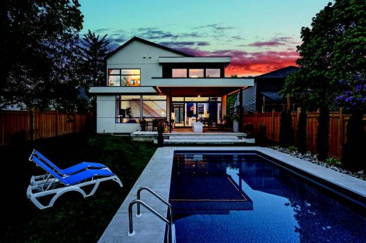
Inside the home’s vestibule, there’s an office to the left, followed by the powder room and a stunning view straight ahead through to the open concept living and dining space. “There’s a clean straight line out to the backyard and pool,” states Joel. “You get a high visual impact from the 45-foot glass wall spanning the back of the home and overlooking the pool.”
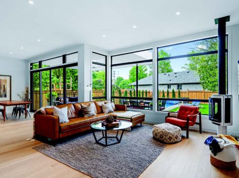
Known for designing unique, one-of-a-kind custom homes, Joel created a main floor office followed by a courtyard indentation between the office and kitchen, which allows light to filter through the kitchen in the morning and midday while the late day light filters through the office window of the courtyard cutout.
“The biggest thing when we are designing a space is natural light infiltration,” says Joel. “The other thing is connectivity to the outdoors so that there’s a nice flow and allows you to spend time enjoying the indoors and outdoors. We created a two-storey box, and the indentation allows different levels of sunlight to filter into the home during different times of the day.”
The homeowners used the same wood slat treatment used on the home’s exterior to create a custom range hood in the kitchen, which seems to add to the natural Scandinavian vibe. It’s a showpiece feature, as is the expansive kitchen, island that features waterfall edges on both sides. Kate adds: “The island is made of quartzite, which is a natural stone. I do like natural elements and the stone has hints of rust and lots of white with linear black accents. It looks like snow-capped mountains, which we love because we’re big skiers!”
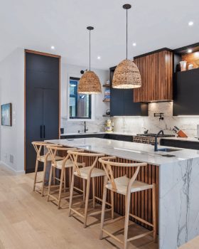
The kitchen cabinets were custom designed by Ritcey Cabinets in Mississauga and the upper cabinets feature European hinges so the doors open upright and up and over the cupboard. Joel adds: “The kitchen is L-shaped and super functional with the open-concept design, with a breakfast nook that flows into the family room with a free-standing gas fireplace. The dining room flanks a 16-foot patio door which leads to a covered backyard entertainment area and BBQ area and pool.”
The family’s love of Scandinavian design could very well have come from the teak dining room table that Kate inherited from her mother. “We are children of the ‘70’s,” she laughs. “We love clean, simple, elegant lines enhanced by organic textures like wool and nubby carpet, which says come in and relax.”
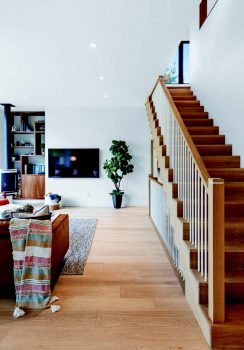
Joel and his team have added many architectural elements throughout the home to surprise and delight. This includes a beautiful curved wall in the hallway and the homeowners designed a duo waterfall staircase in white oak with saw-tooth detail that goes up and then reverses to the lower level.
“The staircase is tucked into the corner so it doesn’t dominate the space and it doesn’t detract from the views, while at the same time it creates a strong focal feature that can be seen from the kitchen and the living room,” describes Joel. “All the elements are designed to blend with one another, but not necessarily take over from anything else in the home.”
A trademark of SMPL Design Studio is to continue the materiality that’s on the main floor into the second level. “So the use of the same flooring detail, same trim detail and wall colours makes the space feel bigger than it actually is,” explains Joel.
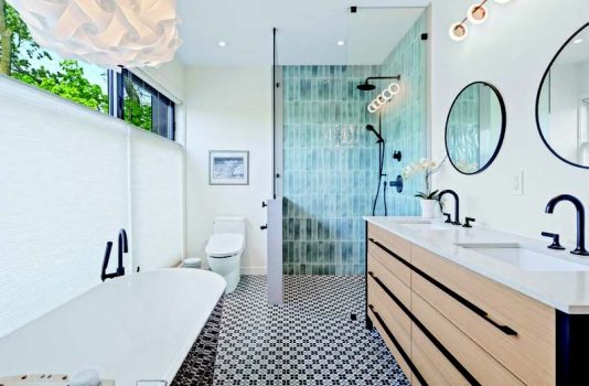
Upstairs, an oversized hallway leads to the two kid’s bedrooms and bathrooms at the front of the home and then the primary bedroom and ensuite face the rear of the home, in addition to a second-floor laundry. The principal bedroom flows into a walk-in closet and then a spa-like ensuite. A wall of windows in the ensuite offers a panoramic view of the treetops. Centre stage in the ensuite is a free-standing soaker tub, centered in front of the expansive window to enjoy the view. Black and white floor tiles with a hint of blue pick up the blue in the freestanding walk-in shower. The homeowners are all smiles when it comes to talking about their new home.
“Joel did an amazing job of realizing our vision on the exterior to create understated elegance with the use of so many handcrafted elements,” says Kate. “I’ve never seen another house quite like it. We just love our home. We’ve built many houses and this one is by far our favourite.” Joel proudly accepts the praise and adds: “My favourite architectural feature is the simplistic materiality all working together harmoniously. It’s a strong piece of architecture for the streetscape that inevitably someone is going to stop their vehicle or stop while walking to embrace the architecture and understand what was built. It’s something that stands out in terms of design and materiality, but still blends well with the neighbourhood.”
For more information on SMPL Design Studio in Hamilton, visit smpldesignstudio.com
