When Danielle Blais moved into her newly built home, she already had plans in motion for a major renovation. As a kitchen designer with Selba Kitchens, she had used the months of waiting for construction to complete to design her ideal kitchen, from the ground up.
“We didn't keep anything from the original kitchen. We started from scratch, taking it right back to the studs, even moving some walls and altering door openings. I knew exactly what I wanted for the space,” she says.
The kitchen is a modern classic. Creamy white cabinetry, smooth marble and professional-grade appliances look over a comfy and inviting living and dining space.
The original kitchen floorplan included an eat-in space, that was retained; but Blais gave it proportion and symmetry with custom built-ins. Two full-depth pantries flank a custom bench with storage, leaving the perfect spot for a high impact accessory.
“Everyone comments on the clock when they come in, it just has great impact.”
“Clients often want a desk worked into a space like this. I find these almost always end up as a spot for clutter, and not used very well. In the space where many would have placed a desk, we chose to do the pantry. It is truly a feature, has great storage and adds scale and proportion and a great focal point, very lovely symmetry.”
Blais wanted as large an island as she could pull off in the square footage, without overpowering the space.
“The island is designed with posts on each end, making it read more like a piece of furniture. It lends a more airy feel to the island, instead of it being just a huge square block. This is one of the features I most often recommend to clients. A little detail like this makes the kitchen have a completely different look, and feel a bit more dressed, especially with our kitchens often being the centre for entertaining and being open to the rest of the home,” she says.
The cabinetry is a style from Selba Kitchens called “Belluz,” finished in a decorator favourite: Benjamin Moore Cloud White (OC-130).
The lower cabinets feature solid panel doors, but upper cabinets are a combination of solid doors and doors with chrome wire mesh inset. The interiors of these cabinets feature glass shelves and LED lighting.
Blais opted to leave the stainless steel refrigerator out in the open, rather than cover with panels. “I actually like the option of not paneling the fridge. I often talk clients through this decision. Some people definitely love it, but I think it's an option you should consider carefully. If the fridge needs repairs, or you need to replace it, it can become a bit of a hassle, and an expensive one,” she adds.
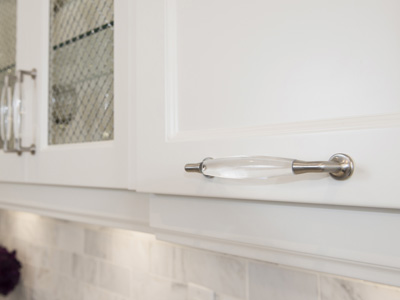
Blais chose to use three different pulls by Richelieu on doors and drawers, and installed them both vertically and horizontally. The clear Lucite with a hint of metal adds sparkle to the kitchen, the perfect accent to a light and airy space.
The backsplash is in a classic subway tile shape, but the tiles are a soft creamy shade of Calcutta marble, another detail that elevates. The six-burner gas stove was finished with a slender profile hood, and the backsplash tiles were taken right up to ceiling, showing off newly installed nine-inch crown moulding.
What looks like marble countertops is actually Caesarstone. “Everyone thinks these are marble, but its not. It's called London Grey Caesarstone, installed in two different profiles: bullnose edge on the island, and straight polished on the counters,” says Blais. “I can't wait to start working with a new finish Caesarstone is introducing called Calcutta Nouveau. It looks even more like marble, with a more sporadic pattern and a heavier grain. Marble is so difficult to maintain. People want the look, but this product is beautiful and so much easier to live with.”
For the floors Blais selected “Escarpment Light” marble in a 12 x 24-inch size tile, adding a very transitional, modern feel. “These do require maintenance, as they will stain, but they are beautiful. They are not what I would recommend for every homeowner, but it's OK for our lifestyle to maintain.”
What other features did the kitchen designer skip while making choices for her own kitchen? The pot filler. “I don't often recommend these to clients, they are costly and not really a function most people find they use often. If you love it and want it in your kitchen then go for it, but I didn't see the need for one in my home,” says Blais.
Blais works as the head kitchen designer at Selba Kitchens in Oakville. Selba is a family owned company that has been operating for more than 25 years. Aside from the showroom and design centre in Oakville, they have a location in Vaughan, where they also have a 120,000 square-foot manufacturing facility.
This fall the Oakville location will itself, undergo a major facelift with a total showroom renovation and grand reopening in November that will coincide with Selba's 12th anniversary in Oakville. The redesigned showroom will boast eight all new kitchens, all showing off the latest and greatest in cabinets and everything else you could dream about for your kitchen.
“I am really looking forward to working with the new Caesarstone surfaces in the showroom. We'll have new backsplashes, custom hoods, lots of incredible options for entertainment areas, mudrooms, and more,” says Blais.
Back at home in this designer's own kitchen, is there anything she would do differently if she had the chance? “This has turned out to be a great kitchen for us,” she says. “I would do it the same again.”
Sitting at her counter over a latte, the final question I pose to Blais in her perfectly styled kitchen: does anyone use this to cook?
“I actually do!” she says with a laugh. “If you open any of the drawers, you'll see where I stashed everything before you arrived!”
