By Danielle Leonard
The world of home design has become a lot more interesting in Ontario with the increasing prevalence of modern architecture. While the west coast has long embraced the unique look and function of modern design, it’s been slow to take hold in Ontario. Yet, it’s clearly arrived. In Mississauga, Oakville and Burlington, traditional home builds are increasingly usurped by the minimalist, clean line aesthetic of modern design.
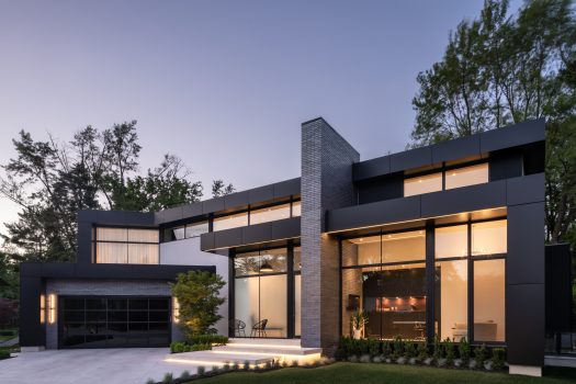
At the forefront of this trend are SMPL Design Studio and Keystone Home Designs – two local firms that are pushing the creative boundaries that define the family home with head-turning designs. Their latest home builds in Oakville add a refreshing and unique vibe to streets lined with traditional style luxury homes. The modern home with its expansive windows, flat roofs and mixed materials were considered too avant-garde by most only a decade ago, but now are welcomed and appreciated.
SMPL Design Studio
Joel Tanner, founder and CEO of SMPL Design Studio, has been designing modern homes since founding his firm more than a decade ago. “Building a modern home was scattered 12 years ago,” he says. “Homeowners were comfortable with modern on the inside but not on the outside. Over the past five years, it’s taking less work to convince clients to have bold architecture on the outside of their homes, too.” He’s pleased that his firm can now focus exclusively on modern design.
“I like modern design because there’s freedom,” Tanner explains. “Traditional homes have symmetry and regulations that dictate how they’re put together while modern architecture has no set of rules.” The homeowners of a recently completed Oakville home initially wanted a conventional design. However, because of the property’s unusual reverse pie-shaped lot, Tanner saw a unique opportunity for modern architecture and, with the client’s agreement, they ended up with a unique design that “hugged the building envelope to maximize the available space” in a way that a traditional home could not.
The front entrance is striking as it’s comprised entirely of glass. A hallmark of modern design is the connectivity between the indoors and outdoors, making expansive windows a key design element. To accommodate the client’s desire for privacy, however, frosted glass was used for the door and the lower portion of the windows; clear glass is above. A tall vertical brick wall, bisecting the front façade of the house, also cuts into the home’s interior acting as a feature wall for the hallway on one side, and the office on the other.
When entering through the front door, a tinted glass staircase runs perpendicular to the brick wall. It additionally acts as a divider between the front hallway and dining room on the opposite side.
The office, which Tanner calls a “jewel of the home” due to the 12-foot windows that encase it, also serves as a block for the back section of the home to enable private living space, where a wall of windows faces the backyard only.
For the windows facing the back, “we maximized the glass panel size to minimize the number of vertical or horizontal window mullions,” says Tanner, referring to the four massive panels of glass creating the wall between the living room and backyard. “I remind clients that most days in Canada it’s too cold to have the doors open, so I shy away from bifold doors.” The four panels maximize the outdoors when entertaining in summer (three panels slide open), while in winter you can still feel connected to the outdoors with a totally unobstructed view.
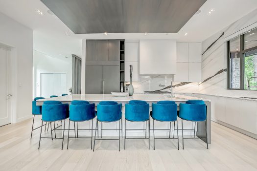
The living/dining and kitchen hub that comprise the main living area of the home, features an L-shape format with the flow proceeding from the front hallway into the kitchen and breakfast bar, then filtering into the living room. White walls that reflect abundant natural light contrast beautifully with the kitchen’s sleek black cabinetry with walnut accents. Providing a stunning anchor to the central living space, the same millwork materials are used on an accent wall across from the kitchen which additionally complements the tinted staircase. Black accents are carried throughout the home, maintaining a consistent look and feel.
On the second storey, the staircase divides the upper level into two wings with the master bedroom on one side and three kids’ bedrooms on the other while an upper hallway overlooks the dining room. Even here, natural light is in large supply thanks to transom windows – a shorter window that runs the entire length of the front façade of the home. “It provides natural art along the hallway,” says Tanner. “You could be looking at a blue sky or autumn leaves during the day and stars at night.”
When asked what’s next in modern architecture for Ontario, Tanner is clear – sustainability. “In British Columbia, every home makes sustainability to top priority. It’s new to Ontario but is gaining steam.” Integrating plants into the design of a home is also on the rise – all part of the desire to stay connected to the outdoors all year long.
Keystone Home Designs
Pushing the envelope in residential architectural design is what drew Gerardo Castillo to modern home design. The owner of Oakville-based Keystone Home Designs grew up in Mexico where he was first exposed to design by observing his older brother, an architect, and the unique residences of his native country. Even today, his annual visits to Mexico continue to influence and inspire him.
“In Mexico each home is completely different,” says Castillo. “Here (in Ontario), the homes tend to look very similar.” He’s wanted to pursue modern home design since launching his design career in Canada more than 20 years ago but admits people simply weren’t ready. Slowly, the tide is turning; Castillo designed his first modern home eight years ago in Oakville and says he now receives more frequent calls from clients requesting a modern aesthetic.
A hallmark of his home designs is the staircase. In two recently completed Oakville homes, an open tread staircase makes a stunning impression in the front entranceway, awash with natural light from adjacent windows that stretch from the main floor to the top of the second storey.
At one home, Castillo recommended the kitchen table be placed at the centre of the living space – it’s what first captures your gaze as you walk through the front door. This is inspired by his upbringing in Mexico where it’s common practice to make the kitchen table a focal point.
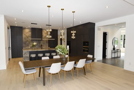
“Most people can’t visualize this,” says Castillo. “They want the table pushed off to the side, but in this home it’s the focal point and it works.” Castillo is always eager to break the rules, push the limits. It’s part of the modern design process and, as a result, “people have to be more open. It’s more creative.”
The great room is designed with entertaining in mind with a 10-seat dining table and 10-seat breakfast bar, opening out to an expansive outdoor living space. With a sliding door in the kitchen as well as the living room, the two access points improve the flow even more.
“I entertain a lot and I know the flow,” admits Castillo who recognizes the kitchen is always the gathering place during a party – allowing easy movement around this central hub is imperative. The dark tones of the kitchen anchor the mostly white space while black paneling and a graphite marble slab surrounding the fireplace on the facing wall create a perfect balance.
The entranceway to a second Oakville home, also recently designed by Keystone, is refreshingly bright. Natural light pours in from almost all angles, reflecting against the white floors and walls. A cascade of hanging lights adorns the three-storey staircase – itself adjacent to a wall of windows.
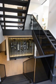
A unique privacy feature wall just ahead of the front entranceway, offers the option of allowing light from the back windows of the home to the entranceway or closing the back off completely to create a solid wall and private dining area. With modern design, privacy can be an issue given the prevalence of windows; providing innovative ways to accommodate this need is essential to some homeowners.
Abundant windows are without a doubt a key benefit of modern home design. Says Castillo, “You walk through anywhere in the house and you see natural light. Big windows, nice views and always sky lights.” Even the basement is designed with this in mind thanks to large windows that open to walkouts with stairs that rise to the main outdoor area.
Because of the pandemic, the home office became a much more valuable room. Here, the office can be accessed from the front hallway or via an external door at the side of the house where a powder room is conveniently located, so that clients can enter without using the front door of the family home. Described by Castillo as a “fishbowl”, the office has two adjacent walls comprised entirely of windows – 13 ft x 13 ft each. It became a beloved spot through the pandemic, enabling the homeowner to watch pedestrians from his corner property and to bask in natural light, regardless of weather.
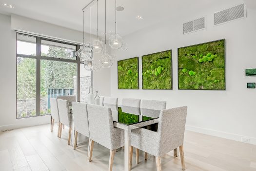
The kitchen, eating area and living room are all connected, featuring white walls with grey accents to create a bright and relaxed setting for the main living space. A trio of custom framed moss art add a natural lush vibe to the space and further accentuates the connectivity between the outdoors and indoors. Including vegetation in his design proposal is typical (the moss art was initially proposed as an entire wall), but local homeowners are often hesitant to commit to his full recommendations. It’s still a new concept in Ontario.
Castillo sees the trend in modern architecture moving in a direction that more closely mimics an upscale hotel look and feel. “In Mexico and the United States and the west coast, you see more of that, but we’re going to get there, too.”
