MODERN HOME ADDS BEACHY VIBES TO ANCASTER | By Rebecca Dumais / Photography by Craft Architecture Photography & Video
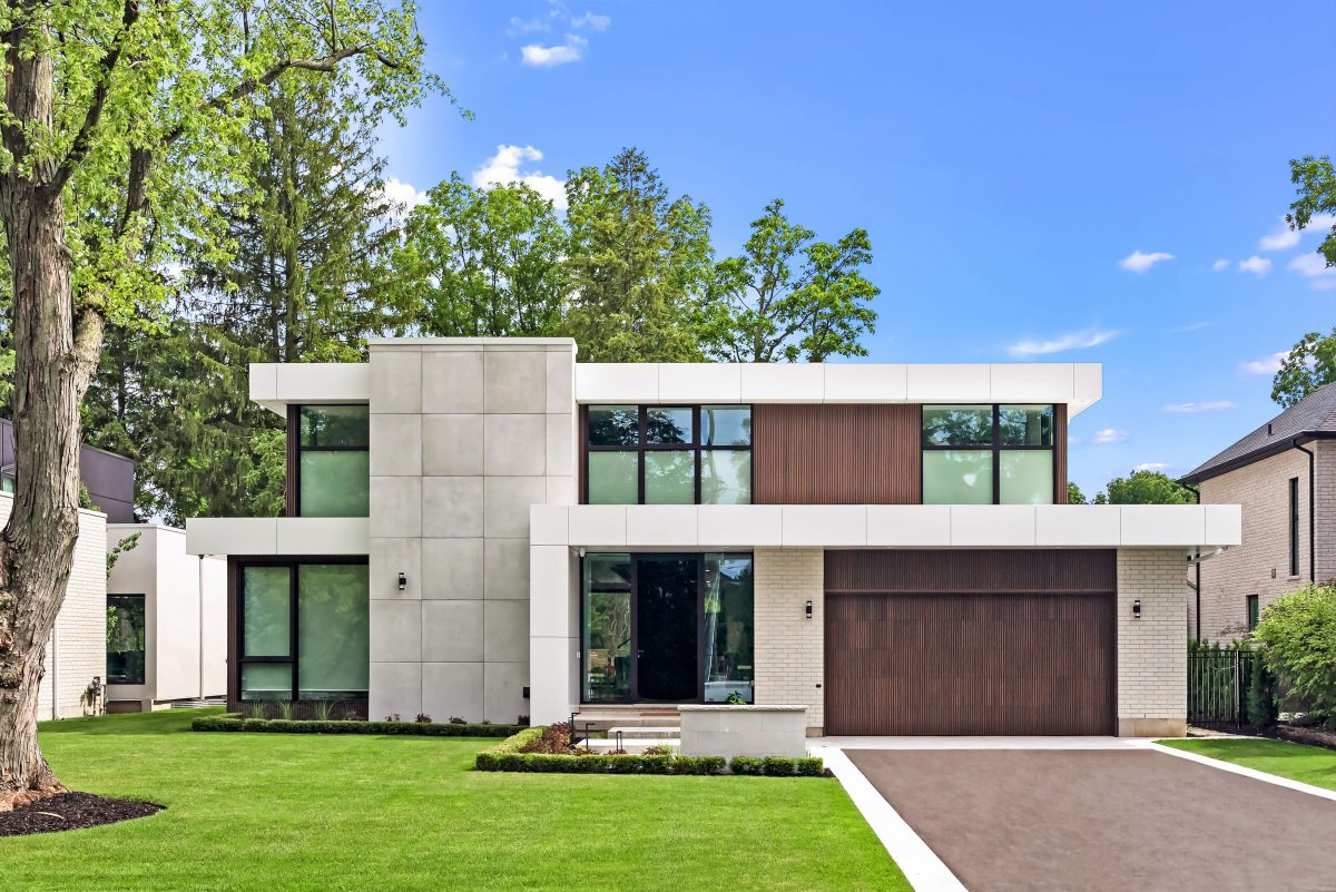
The linear, clean lines of Miami-inspired homes are increasing in popularity and that’s just the style of home that clients Sandro Cioci and his wife Nicole wanted for their custom Ancaster build. The 3,900-square-foot home was built by Agrigento Homes and architecturally designed by SMPL. It has four main bedrooms, five bathrooms and two fireplaces and a fully finished basement with an additional bedroom.
Constructing the home within a traditional community came with certain parameters. “It’s in the middle of Ancaster so you’ve got to bring back the warmth and airiness that the community so desires in architectural homes there,” explains CEO/Creative Director Joel Tanner. “That’s really what launched the project – something different and unique.”
Another trigger for the design, according to Tanner, is the location of a modern build right next door, completed by SMPL and Agrigento a year prior – plus another home down the street. “We don’t want it to look the same as any of our other projects. That’s always a stepping off point for how we’re going to design the architecture and get the intent out of it that we want and not have it look like the neighbour’s home, which I think we did quite well,” he says.
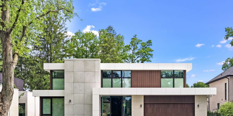
Deviating slightly from the stark white style of typical the typical modern Miami home, Tanner wanted to ensure a warmer colour palette was used. “We have a vertical grain wood siding (on the exterior) which really helps pull the whole design together in addition to a feature concrete panel tower at the centre of the home,” he says. “Those two elements help break the house out of that Miami mould, so to speak, but at the same time have the flavour and styling architecturally the clients are drawn to.”
The Town of Ancaster places restrictions on builders, according to Gueli. Since one of the main features of a modern home is a flat roof, it actually helps achieve the desired height because there are no trusses. “It’s been helpful,” he says.
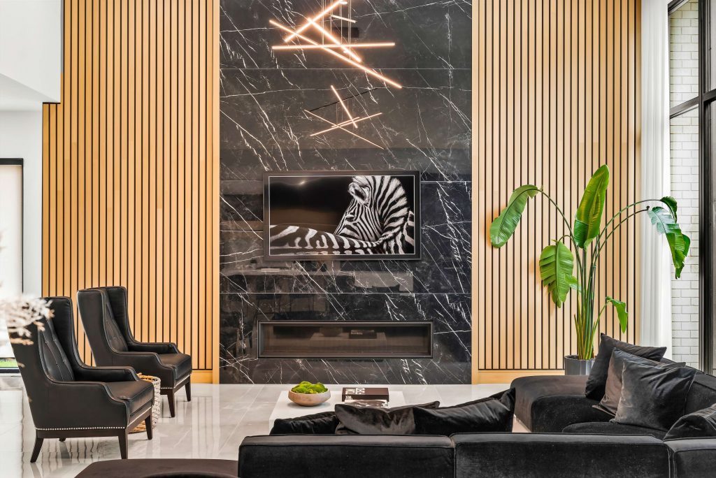
All of the core living space – kitchen, living, dining – is pushed to the rear of the home. This also means the use of windows can be maximized on the front of the home without feeling like the living areas are exposed. The home also lets in an abundant amount of light at the back courtesy of the features that Cioci was set on: an elevated ceiling in the great room – at 15 feet high with a 12-foot-high window. “I like that large scale,” he says. The room is open to the kitchen, which has a 10-foot ceiling. The change in height “creates a level of elegance that’s very eye-catching,” says Tanner. “It further accentuates the glass wall change at the back.”
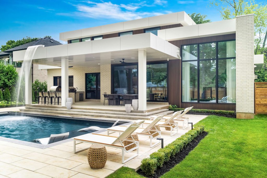
The clients also wanted a large patio slider at the back of the home, so a 16-foot long, 10-foot-tall slider was added to the design, which opens to the backyard. Some of Gueli’s favourite features include the exterior finishes and colours. “I like the whole vibe of the outside. The backyard is amazing,” he says. “We built this second-floor waterfall feature that shoots off of the roof and into the pool. That’s probably one of my favourite things. I really like the vaulted family room – it almost feels like a grand hotel lobby.” Landscaping was done by Granite Park and the pool was installed by Tropical Pools & Spas.
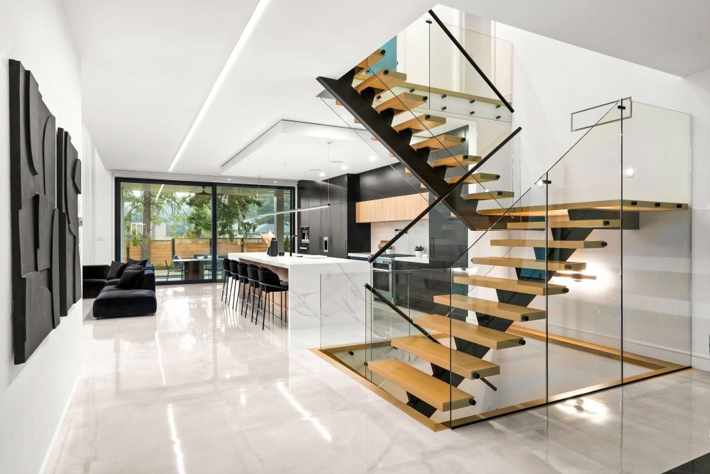
The feature staircase, visible upon entering the front door, is steel and wood with a glass railing. “It creates a division point between when you enter the front of the home and what is the kitchen directly behind it,” notes Tanner. “The nice thing is that as much as you’re coming right into the home, you’re looking at a very strong architectural focal feature, so your mind isn’t necessarily drawn to the kitchen or the living room and it forces your eyes to embrace the staircase, kick off your shoes, hang your coat and then get greeted into the home from there.”
Letting the materials and forms speak for themselves and dictate design is exemplified by the distinctive concrete tower. “What the tower is doing is breaking up the overall lineal form of the home and it’s creating a more centralized, vertical element,” Tanner says. “The great thing is, we could hide a room behind it that doesn’t necessarily need natural light. We hid the powder room in behind it and then we have a bathroom closet space on the second floor that’s tucked in behind it,” he adds, noting that the tower also helped create structure to the inside floorplan.
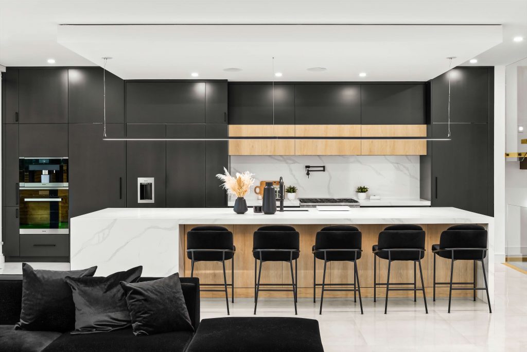
Glancing at the kitchen, you wouldn’t know what’s behind the matte black and white oak cabinetry, installed by Royal Kitchen Doors & Cabinets. A large hidden door beside the fridge leads to a pantry with another fridge and smaller kitchen, and a sliding glass door that leads out to the covered outdoor kitchen and eating area. On the right side, a hidden door goes to the laundry and mud room, which also has access to the garage.
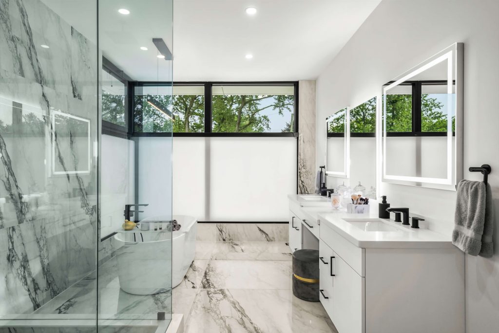
The master bedroom ensuite features a large double shower, soaker tub, vanity and private toilet closet, and also a door that leads into the large walk-in closet. The homeowners took on the interior design themselves. The resulting palette is clean, neutral and bright. Porcelain flooring flows on the main floor and hardwood in the bedrooms. All flooring was sourced from Saran Tile. “SMPL’s interior design team helped with the design of the kitchen colour scheme. I knew what colours I wanted but they definitely nailed it,” he says.
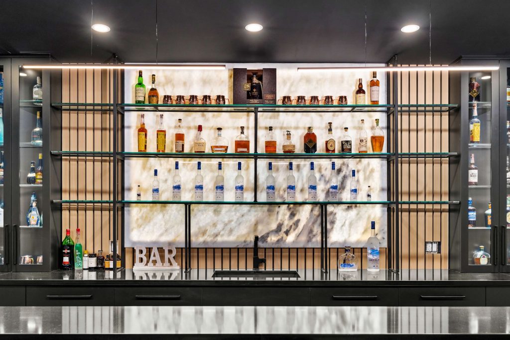
The powder room is a striking black theme: cabinetry, penny tile on the floor, paint and tile on the walls. All of the bathrooms have backlit mirrors. The master bedroom bath is finished in white with touches of grey and black, and black taps were used throughout the home.All the mancave musts can be found in the basement. “I like (it), kind of having everything down there,” Cioci says. The open concept theatre is situated so that people can be seated at the bar and still view what’s playing. “The bar wall of backlit onyx is a cool feature,” he says.
There’s also a wine room, gym, bedroom and a bathroom. “The space is really nice.” SMPL’s design schematic was executed perfectly, according to Tanner. The clients chose the right materials SMPL pushed for, and the client adhered to the colour tones, materiality and textures. “The idea is that we’re the professional that’s guiding you to get you to the finish line. This client and builder very specifically followed the course we created, and I think because of the careful execution, that’s what anchors the project’s success. Passers-by and neighbours are very appreciative of that when there’s a finished piece that stands out in the crowd.”
For more information visit smpldesignstudio.com and agrigentohomes.ca
