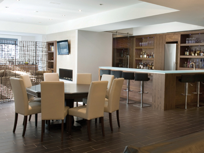
Contemporary design, when done well, is a pleasing fusion of form, function and beauty. The new home, featured here, was built on a site where a church once stood in Oakville and is an expression of transitional contemporary style ““ with clean lines, spacious open rooms and lack of fussiness. It is classically beautiful and yet warmly inviting too.
So, what exactly is contemporary design? The Museum of Modern Art defines contemporary design ““ contemporary being an adjective, not a style ““ as “well-made, beautiful, efficient, innovative and reflective of its time. It is concerned with environmental concerns, global awareness, economy, durability, experimentation, technology and simplicity.”
Contemporary by definition means “existing, or occurring at the same time; belonging to the same time.” And that is how the term is used in interior design. Contemporary design refers to what is popular at this moment. It can be very eclectic, as it changes and borrows from all different eras, and can include furniture and art from the modern era, paired with tradition mouldings and millwork.
A contemporary home usually incorporates large windows, an open plan and harmony with the surrounding landscape. The finishes use natural elements like wood and stone, and the finishing details and furniture are unfussy, with clean lines. Contemporary interiors feature tone-on-tone colour palettes leaning towards brown, taupe, cream and pure white. Shots of colour are sometimes found on a single wall, in a carpet or in the artwork. Comfort and sustainability are often the key values in contemporary design decisions.
This architecturally-designed home could be a textbook example of the best of contemporary design.
Gil Mistry, of Misani, an Oakville company that designs and manufactures custom cabinetry, worked closely with the owners to make their vision for the interiors of this contemporary home become a reality.
“The clients wanted the home to be inviting and approachable. We worked together well, and they trusted our vision and design aesthetic. Misani goes above and beyond functionality. We didn't just design and manufacture the cabinetry ““ we integrated the clients' concept for the house into the material choices and finishes. They were very happy with the results.”
Contemporary design can sometimes be cold but this house exudes warmth. “We used walnut as the wood of choice for most of the cabinetry,” Mistry explains. “It can be a difficult wood to work with as the grain pattern has to be factored in to each piece. But it has a unique character, and adds an appealing tone and warmth because of the natural patterns in the wood.”
That attention to the balance between aesthetics and function is most obvious in the kitchen, a space that is at once practical and warmly attractive. The lower cabinets are dark stained walnut, with a natural finish on the upper elements of the room. A discrete steel reveal adds visual appeal to the wood. It's ultra sleek and linear without being cold.
The integrated appliances wall and large pantry, along with the island and the lower cabinetry, all dark stained walnut, anchor the room, while the natural walnut pillar-style surround over the oven gives the space lightness. A walnut floating ceiling treatment with pendant lights is suspended over the island and ties in to the cabinetry, while the island, with a secondary sink and granite countertop, provides ample casual dining room.
The dining room is spaciously sized for the entertaining that the owners do frequently. To delineate the dining space, Mistry designed a floating glass wall, suspended between two walnut pillars. A cross-grain insert halfway up the columns adds interest and variety.
The mantle in the living room displays a floating hearth.
In a more casual seating area, a walnut wall provides visual interest, with bookmatched walnut grain and shelves for display. A half wall separates the seating area from the hallway. This contemporary space has a feel of “everything in its place.” There is no tolerance for clutter, only fine design.
In the outdoor bar and kitchen, the cabinetry and ceiling are walnut, with cabinets painted with Benjamin Moore's Metropolis grey. A feature wall with randomly placed tiles adds visual interest, while a screen separates the area from the side yard.
Another bar area on the bottom floor is the perfect place for casual entertaining. It's beautifully designed ““ and totally inviting. The walnut shelves and bar are light in colour, and the bar is topped with an underlit milk glass countertop. There's room for eight to sit comfortably. One outstanding detail is the walk-in wine cellar, with an elegant, barn style sliding glass door.
The bar area leads naturally to a seating area, with more walnut detail in the built in shelves and cabinets.
The downstairs washroom also received the walnut treatment, with cabinets, surrounding shelves and cupboards finished in the warm wood tones, while another floating walnut ceiling treatment with hanging pendant lights ties the space together. A large mirror placed above the sink adds to the feeling of space.
It is a liveable, inviting home, and, as an example of the contemporary style championed by architects like Frank Gehry and Zaha Hadid, it is a compelling response to the zeitgeist.
It's both a home and a statement.
